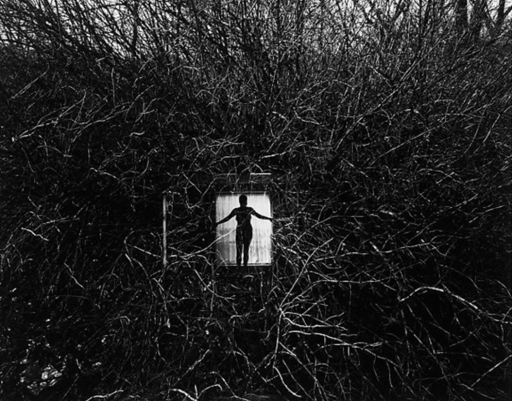
This photo centers around the white box in the middle and the branches of the surrounding area help lead the viewers eyes right to that white box. This composition really allows the views to be drawn right to the center of the image. Additionally, in the white box in the middle of the photo there is a silhouette of a person standing with her arms spread out. It seems as though the light is coming from within the box which is creating that backlit look. Surrounding the box the photo is mostly dark but it looks as if the top of the photo has some sky perhaps in the background making the branches at the top of the screen more defined then the branches in the bottom of the screen which are harder to see because the photo is so dark. However, some of the branches seem as though they caught some light which does add more excitement and detail to the picture because the individual sticks are relatively easy to see.


Good description of the light on the branches and the backlighting.