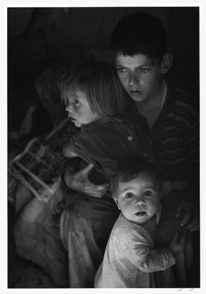
The successful of this image is that the composition and the lighting together create a highlight on the child in the front. The composition of the children is a reverse triangle, with two vertices at the back and one in the front. Meanwhile, the light coming from the light of the image barely lighten the two children, which only their faces and the upper part of their clothes in dark color are bright. However, the little child in the front wearing white cloth gains the best lighting. The light not only make him the center of the image, but also creates a split lighting on his face. Even more, with him the only person facing the camera, the tiny reflection in his eyes adds an extra layer of vividness to the image.

Good observation of the underlying triangle in the composition and the increasing intensity of light towards the child in the foreground.