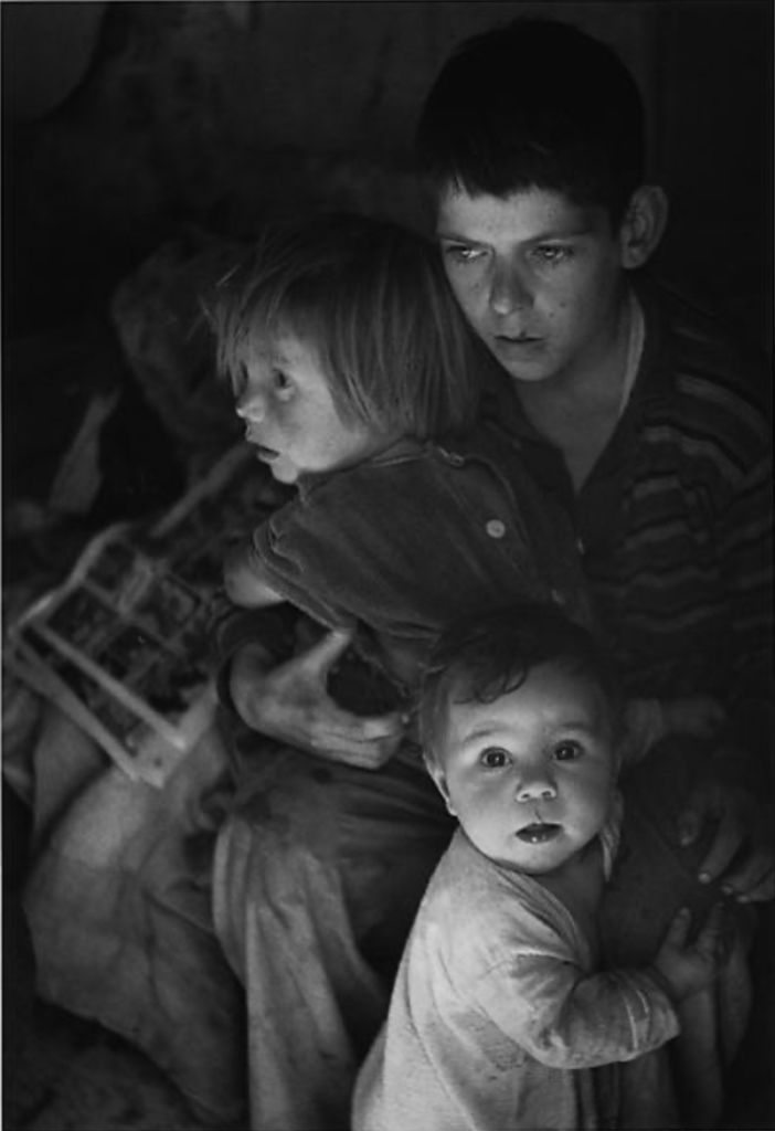
The composition I chose by Ansel Adams is called the Trailer Camp Children, Richmond, California which was taken in 1942. This piece executed the use of lighting in this photo perfectly. The light highlights the children’s face and still allows us viewers to see as much of the clothing g as we should. The background is hard to see and less visible due to the lighting but that is the exact point. Assuming this piece is shot in the children’s trailer park home it really hides the background and highlights the beautiful souls of these children. At first glance I would have never none their situation without context all though they do seem worrisome. The lighting alters what we see and elevates this image in many ways.


You could describe the lighting in more detail – where it is brightest. I like that you note their expressions are “worrisome.”