https://www.blurb.com/bookstore/invited/9158123/656e1bf8110c6bcd065f84af4f6b86c4a36eb475
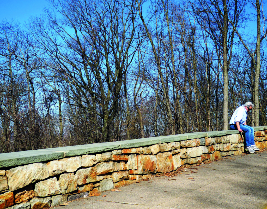
Lehigh Lookout 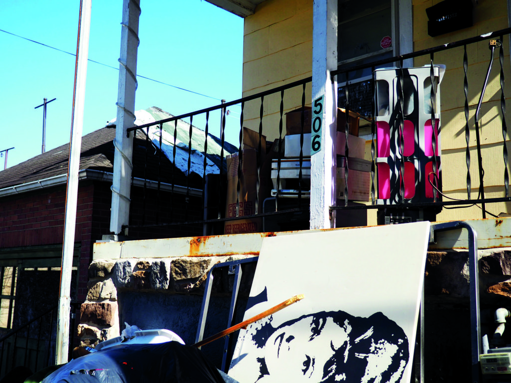
Local Curb Trash 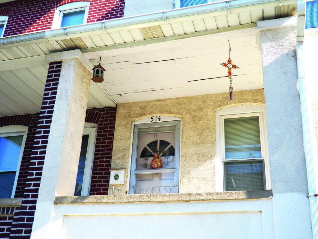
Resident’s house 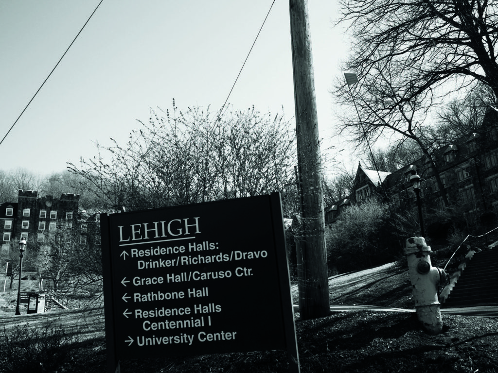
Campus Sign 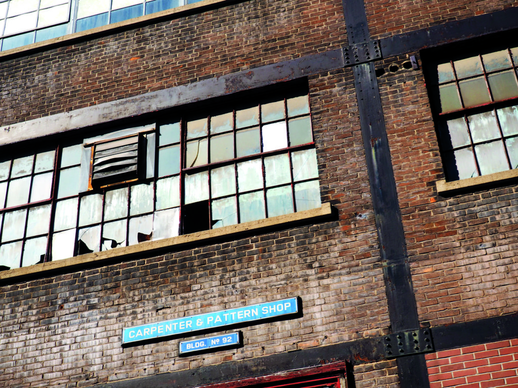
History 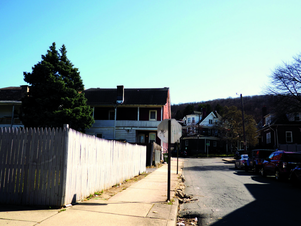
Look down the Street 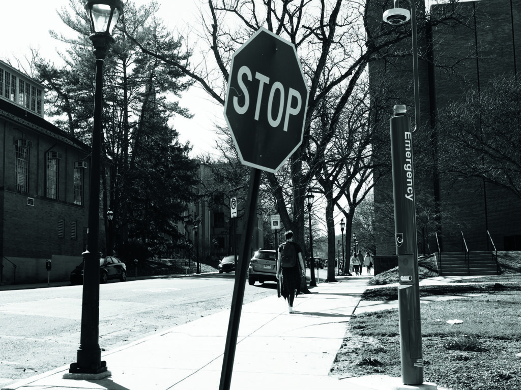
Walking on Campus 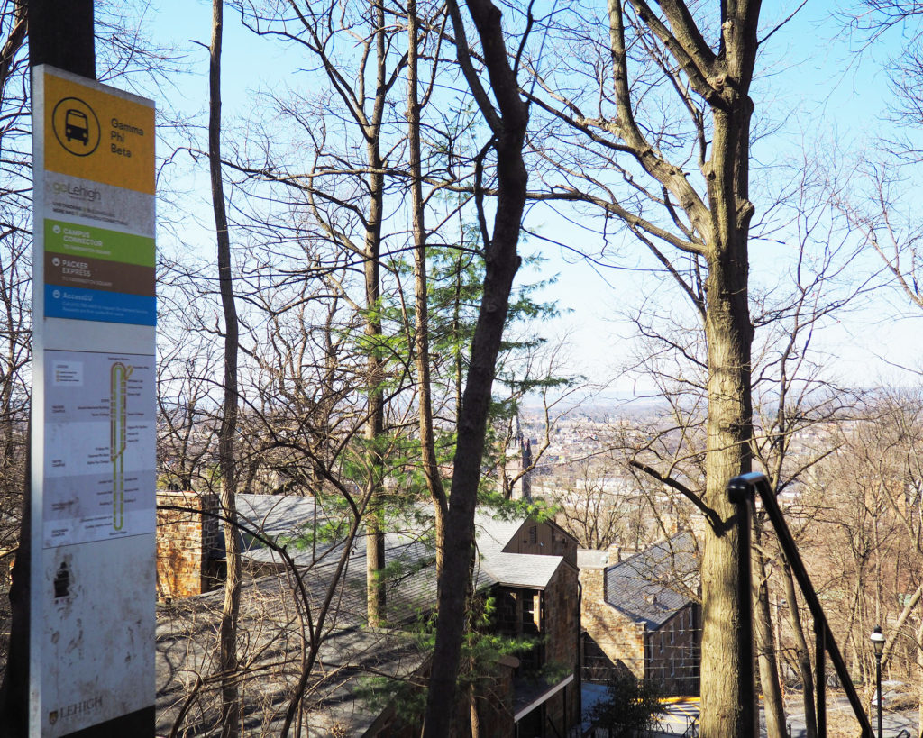
From the Hill
https://www.blurb.com/bookstore/invited/9158123/656e1bf8110c6bcd065f84af4f6b86c4a36eb475


You must be logged in to post a comment.
The shots definitely improved when you were closer to the edges of buildings. On your cover, your name could have been moved to be in the white border.
I really liked your idea of getting shots on campus and also off campus. I think it shows the differences between the pretty greenery and old architectural style of lehigh versus the relatively run down houses that surround campus. I also liked how you used a mix of black and white and color photos. In the color photos it was evident that “color” was one of the main focuses of the image and the black and white were more focused on composition. Overall I think your idea was really cool!