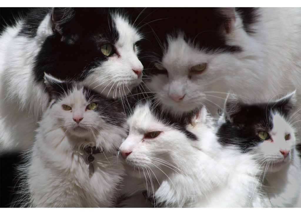
Draft #2: Cat 
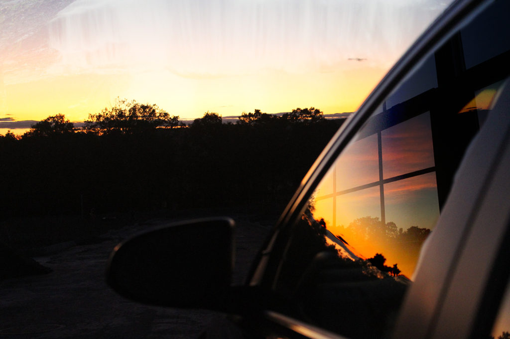
Draft #1: Sunset
My first idea was to use pictures of the sunset. Through my experience in overlaying and masking in photoshop, I wanted to make the image seem as clean as possible so I used a very soft brush at 0% hardness to make each image flow into either a negative space or another photo. I thought about making multiple photoshop projects and working from there since trying to include all twelve images into a single document at once might have been tougher. After finalizing draft #1, I moved to a new template and focused on a series of new images I took of my cat. I remained consistent with the photoshop techniques, but I did mess with the opacity of certain layers to make it look more even in terms of what sticks out.

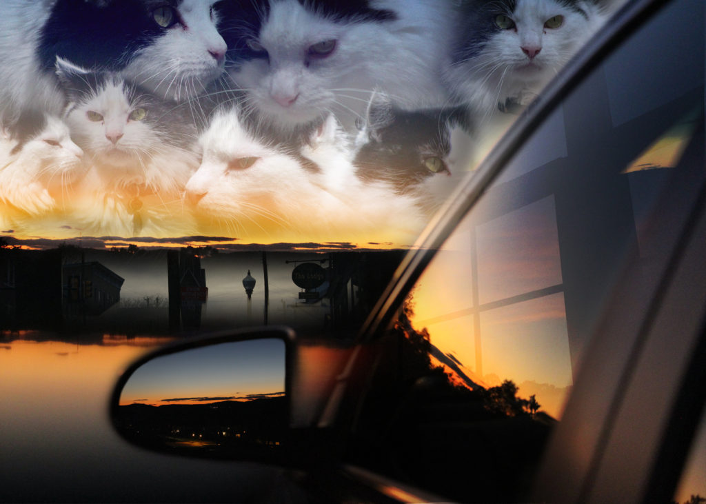
Final Montage: Sunset Cat
Satisfied with both drafts, I decided to combine both images and realized there was definitely more I could do with the negative space on the bottom left. I used another photograph I took of the sunset reflected on my iPhone screen and placed it on top of everything and then used a masking layer to bring out the layers I designed previously. The side mirror became a little faint at this point so I duplicated the layer of the car and utilized 100% opacity and masking layer to focus solely on the side mirror. Now that I filled in that negative space, I got the idea to add an image to the side mirror (Thanks Professor Chupa). Having completed all of this, I decided to use my ability to take a photo I put in my book and placed it in the center of the image. I think it goes along nicely with the whole idea of reflection in my design. My main goal was to represent this surreal and dreamy image through the use of reflection, because I realized that making use of space given by reflection could be perfect for adding more to the image.


Your consistent use of color unifies the different elements well and makes your composition cohesive.You have used a variety of edge qualities and transparencies throughout which strengthens the sense of depth.
I really like this piece because the use of the sunset is really unifying throughout. I also like how the black in the middle almost gives me the illusion of water separating the car from the sunset, however it has another reflection which makes the piece more complex. The cats in the sky add a little bit of light heartedness to the piece as well which I enjoyed.