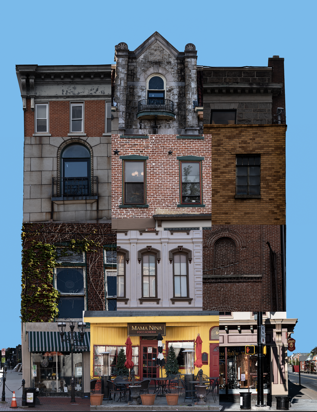
I really like how this turned out! I love the blue you chose for the background! I recognize so many of these buildings and its fun to see them combined together. You also got to combine some very interesting architectural features and varying materials which create a really interesting piece of work with a lot of great contrast!
I like how you’ve anchored the bottom with street-level floors and sandwiched the middle floors with top level floors that have heavy enough cornices to hold everything together. You have maintained the expected order of floors but added variety with your selections.
I really really like how this montage came out. I think this is really cool idea. It is very impressive how you made it so cohesive and look like a real building. In addition to that, I think that the colors all work well together which I know can be difficult when working with colors and textures. My favorite part is the smaller detail of the streets and houses on the side. I think this really amplifies the building as a focal point and makes the composition better.
This was my favorite montage shown in class, and I wish I had taken a similar approach. I really like how you made a clean outline of the building, making it appear as an actual building, but then utilized straight edges for the photos within the building pointing out the clear differences. Additionally, the way the building starts with the lightest photos on the bottom and slowly tapering to darker photos is very well done. The only thing I might have changed was to bring the telephone pole in the photo on the bottom right into the foreground completely so that it isn’t cut in half by the photo above. Overall, very nicely done and super creative.